Redesign

KSP App

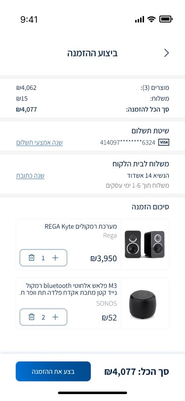
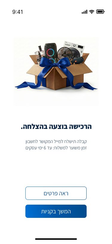
Transforming a complex, text heavy interface into a streamlined, personalized shopping experience by simplifying logistics and visual clutter.

Context: Personal project within a UI/UX design program.
My Role: UX Research, Strategy & UI Design
Duration: may - august 2025

ksp screens

Background

While KSP is the market leader, its app lagged behind modern standards, functioning as an internal data dump rather than a customer facing shopping experience.

Problems Statement

The application was hindered by extreme visual clutter, a text-heavy interface, and confusing logistics.

1

Extreme Cognitive & Visual Overload,
The interface lacked visual hierarchy.

2

While KSP is the market leader, its app lagged behind modern standards, functioning as an internal data dump rather than a customer facing shopping experience.

3

While KSP is the market leader, its app lagged behind modern standards, functioning as an internal data dump rather than a customer facing shopping experience.

Research

Market Research
My research into leading e-commerce apps revealed a clear "visual first" standard, prioritizing large images over text. Crucially, these apps hide complex logistics, presenting a simple binary availability status instead of raw inventory data.
Market-Research-ksp
User Research
I spoke with consumers to understand their pain points with the current KSP app.

They developed "workarounds" such as adding items to the cart just to see the final shipping cost or stock status because the product page was too confusing.
persona
persona ksp
User Journey: The Streamlined Purchase Journey

The Solutions

The redesign addressed the core problems through specific design goals, framed as "How Might We" questions.

Goal #1

How might we reduce cognitive load and transform a text-heavy interface into an intuitive shopping experience?

Home page

Visual Minimalism
Creating a clean, uncluttered interface that reduces cognitive load and focuses user attention on essential content.
Before
After
Visual Minimalism
Creating a clean, uncluttered interface that reduces cognitive load and focuses user attention on essential content.

Search & filters

Streamlining product finding through a prominent search bar and a smart, easy-to-use filtering system.
Clear Information Hierarchy
Prioritizing important information, while making technical details accessible without overwhelming the user.
Before
After
Before
After
Clear filtering options
redesign the filtering options to be intuitive, utilizing customer-clear language and displaying only relevant data.

Goal #2

How might we simplify complex backend logistics into a clear, binary choice for the user?

Smart Logistics Based on Personalization

The challenge was to obscure logistical complexity to reduce cognitive load. The solution uses personalization to present only relevant data in real time.
Before
After
Before
After
Smart Onboarding
One-time setup at signup saves user shipping and pickup preferences as permanent defaults, streamlining future visits.

Secure Purchase Completion

A seamless and fast payment experience designed to save time and make finalizing purchases simple and easy.
Before
After
Frictionless Checkout Flow
Simplifying the purchase path into minimal steps, removing barriers, and requesting only essential information.
Post-Purchase Reassurance
An immediate confirmation page that gives confidence the order was successful. It shows all important information in one place, to end the purchase with peace of mind.

Conclusion & Reflection

This project demonstrated that effective UI/UX design is not just about aesthetics.

The biggest challenge was taking a data heavy organizational structure and hiding that complexity behind a simple interface.
By shifting the burden of processing logistics from the user to the system through smart defaults and personalization, the KSP app transformed from an intimidating data warehouse into an inviting, modern e-commerce experience.

Try it yourself

Feature

WhatsApp

Status Group Management
© 2026
TopDesign.
+1 848 318 6585